
We are taking a look at the FileMaker charting object, specifically how to collect the data for a chart. We started the discussion in the previous post. I’ll repeat what I said there:
FileMaker chart objects will render a returned-delimited list of data in a visual way. That’s all you need to know. If you can pass a list to the x-axis and a matching one to the y-axis (as applicable), then you can display data on a chart. It is really that simple.
You can download the demo (below) and review the video.
We previously looked at the Current Found Set data source, which is a very valid and useful source of data. In this post, we’ll look at the remaining two data sources: Related Records and Current Record (delimited list). Let’s start with Related Records.
Recall our data set.
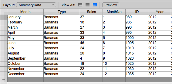
The summary data we will chart.
Related Records
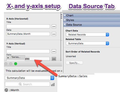
Data Source: Related Records
There’s not a whole of discussion around this; it is pretty straight forward.
I could easily set up a chart on a record in the products table and easily display that product’s sales to tell any story we wish: sales per month of a particular year (as defined by the relationship) or all of the data for every year, or for any month (as defined by the relationship). Think of this as a portal with bars or lines or slices.
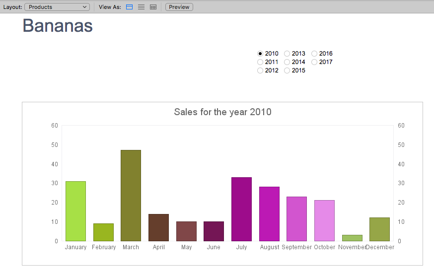
A graph with related data shown.
There is not too much to this. Notice the Data Source Tab in the picture above. I have the sort order of related records unsorted. That’s okay. I chose to sort the records in the relationship. But it can be done here instead. And if you allow the sort to happen in the FileMaker charting object (like we would do a filter) you can use summary fields instead, just as we can do with the Current Found Set Data Source.
There’s a lot of flexibility with this kind of data source as well. If you need a chart to show related data, throw one of these on a detail record, point it at some related records, and you’re good to go.
And now we get to the fun one:
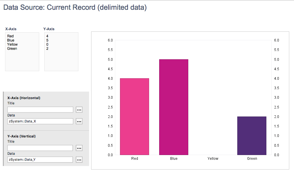
Current Record (delimited data)
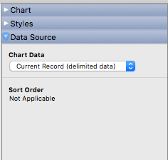
Data Source: Current Record (Delimited Data)
It isn’t obvious from this data source, but this source is the most flexible to do FileMaker charting. For the third time, I’ll restate: All we need to do is a pass a return-delimited list into the x- and y- axis.
Using this data source, we get full control over what is passed in.
This chart has two fields from which the data comes. I can set up a chart like this pretty easily.
Full Control over the data passed into the axes.
But if we stop and think about it, we really only need the list of data for each axis. Rather than putting it in a field, we can put it in the calc dialog of the axes themselves.
Heck. We don’t even need a hardcoded function in there. We can use a variable: $$xaxis in there and, using a script, set that variable to be a return-delimited list of data.
Collecting the Data
The FileMaker charting object needs a list of data, so we need to create a list. We can do that in many ways.
List ()
Our go-to list-generating function, but it contains some issues. The list function returns nonblank values, and it doesn’t ‘skip’ a row for the blank one. If we collect a list of data from two fields in a table, the two lists are not synced up. I would only use this if I was sure that every list I made had each and every record accounted for in the result.
ExecuteSQL()
Developers love using this to gather a list of records since it can be called from anywhere. I’ve seen a chart using this function in a dashboard set up–a layout with multiple charts on it, with each chart’s axes using this function to collect data.
ExecuteSQL will return a blank value. But it has its limits. You have no control over when it is called, so if five charts use ExecuteSQL, that’s around ten calculations happening at once. If any of the records upon which the query is running are open, a documented performance drain will occur.
ListOf Summary field
This is useful but, like the list function, this skips blank records in a field. Like List(), I’d use this only when I had a record for every point of data across the two axes.
Looping through records
Using HyperList 2.0 or another method, I write a script to gather the data from the found and sorted set, setting a variable in a loop.
However you collect the data and form it into a list, you just to make sure you have all the values in the two lists (x and y axis lists) correspond exactly. It would be disastrous if the lists got off–our data would be unreliable and therefore worthless. So be careful in your gathering of the data.
One more thought, just a bit off topic
In the examples for this and the previous post, I used a table called “SummaryData”. It is a table with one record per product / month / year combination that summarizes the total sales across all invoices. At the end of the month, I run a script that totals the sales for each product for that month and stores it in this table. The data is stored and static. For months with zero sales, there is still a record (zero is a total), so I do not have that problem.
I prefer this method for chart displays. Since charts do often display summary data, it is logical to gather the data from a table where the data is stored.
We’ll explore this idea of a summary table in a future post. I just wanted to bring it up now.
FileMaker Charting Now and Next steps
Go forth and use the FileMaker Charting object to create good-looking visualizations of your data. FileMaker charting might be confounding at first glance, but it can be easily understood given a few practice runs. This charting method will suffice for much of your graphing needs. One of the leaders of the FileMaker world that uses the FieMaker charting object in all his data reporting tools. They’re extremely adequate.
However, since Native FileMaker is almost limitless, we do have the option of exploring using a JavaScript library to construct a graph. This option gives us so much more options in customizing the graph: colors, fonts, sizes, widths of lines, space between columns, etc.. In the near future we will explore these possibilities.
Trackbacks/Pingbacks